05 - 盒子模型
选择器 3
结构伪类选择器 Structural Pseudo-Class Selectors
- 伪类选择器是一种用于选择特定元素状态或位置的方式,结构伪类选择器(Structural Pseudo-Class Selectors)则是伪类选择器的一种。
- 结构伪类选择器允许根据元素在其父元素中的位置和结构来选择元素,从而实现更精细的样式控制。
| 选择器 | 描述 |
|---|---|
:first-child |
选择父元素的第一个子元素。 |
:last-child |
选择父元素的最后一个子元素。 |
:nth-child(n) |
选择父元素的第 n 个子元素,可以使用具体的数字、公式或关键字(如 even、odd)。 偶数标签 2n,基数标签 2n±1 5 的倍数的标签 5n,第 5 个以后的标签 n+5,第 5 个以前的标签 -n+5 |
:nth-child(even) |
选择父元素下所有偶数位置的子元素。 |
:nth-child(odd) |
选择父元素下所有奇数位置的子元素。 |
| -- | -- |
:nth-last-child(n) |
选择父元素的倒数第 n 个子元素,同样可以使用数字、公式或关键字。 |
:first-of-type |
选择父元素下同类型的第一个子元素。 |
:last-of-type |
选择父元素下同类型的最后一个子元素。 |
:nth-of-type(n) |
选择父元素下同类型的第 n 个子元素。 |
:nth-last-of-type(n) |
选择父元素下同类型的倒数第 n 个子元素。 |
<!DOCTYPE html>
<html>
  <head>
    <style>
      /* 选择第一个子元素 */
      .list li:first-child {
        font-weight: bold;
      }

      /* 选择最后一个子元素 */
      .list li:last-child {
        font-style: italic;
      }

      /* 选择第三个子元素 */
      .list li:nth-child(3) {
        color: red;
      }

      /* 选择偶数位置的子元素 */
      .list li:nth-child(even) {
        background-color: lightgray;
      }

      /* 选择奇数位置的子元素 */
      .list li:nth-child(odd) {
        background-color: lightblue;
      }
    </style>
  </head>
  <body>
    <ul class="list">
      <li>苹果</li>
      <li>香蕉</li>
      <li>橙子</li>
      <li>草莓</li>
      <li>蓝莓</li>
    </ul>
  </body>
</html>
- :first-child 伪类选择器:这个选择器会选择元素的第一个子元素。
.list li:first-child来选择列表中的第一个<li>元素,并将其文字加粗显示。
- :last-child 伪类选择器:这个选择器会选择元素的最后一个子元素。
.list li:last-child来选择列表中的最后一个<li>元素,并将其文字样式设为斜体。
- :nth-child(n) 伪类选择器:这个选择器可以根据元素在父元素中的位置来选择特定的子元素。
.list li:nth-child(3)选择列表中的第三个<li>元素,并将其文字颜色设置为红色。
- :nth-child(even) 和 :nth-child(odd) 伪类选择器:这两个选择器分别选择偶数位置和奇数位置的子元素。
.list li:nth-child(even)选择列表中偶数位置的<li>元素,并为其设置浅灰背景色;.list li:nth-child(odd)则选择奇数位置的<li>元素,并为其设置浅蓝背景色。
:nth-child(n) 和 :nth-of-type(n) 区别
:nth-child(n)选择器与父元素下所有子元素的位置有关。例如:ul li:nth-child(2)选中ul元素下的第二个子元素,无论是什么类型的元素。:nth-of-type(n)选择器与同类型的子元素的位置有关。例如:ul li:nth-of-type(2)选中ul元素下类型为li元素的第二个子元素。
<ul>
  <li> 列表项 1</li>
  <li> 列表项 2</li>
  <li> 列表项 3</li>
  <li> 列表项 4</li>
  <li> 列表项 5</li>
  <div> 其他元素 1</div>
  <li> 列表项 6</li>
  <div> 其他元素 2</div>
</ul>
/* 使用:nth-child(n) 选择器 */
ul li:nth-child(3) {
  color: red;
}

/* 使用:nth-of-type(n) 选择器 */
ul li:nth-of-type(3) {
  color: blue;
}
- 使用
:nth-child(3)选择器,会选中第 3 个子元素,即列表项 3。所以列表项 3 的颜色将被设置为红色。 - 使用
:nth-of-type(3)选择器,会选中第 3 个类型为li的子元素,即列表项 2。所以列表项 2 的颜色将被设置为蓝色。
伪元素选择器 Pseudo-Element Selectors
- 伪元素选择器(Pseudo-Element Selectors)允许在文档树中的特定元素部分之前或之后插入样式化的内容。
- 伪元素允许创建不在 HTML 文档中实际存在的元素,从而在样式中添加装饰或修饰性内容,如添加引号、图标、样式化的
::before和::after等。 - 伪元素选择器使用双冒号
::表示,以区别于伪类选择器(单冒号:)。 content属性用于定义伪元素的内容,可以是文字、图标代码或空字符串。- 伪元素实际上并不在文档中创建新的元素,它们只是在样式中创建虚拟的、附加的内容,用于装饰或修饰性目的。
- 伪元素可以与其他 CSS 属性结合使用,如颜色、字体大小、定位等。
- 像
::before和::after这样的伪元素选择器在创建自定义样式化标记、图标或注释时非常有用。
| 伪元素选择器 | 描述 |
|---|---|
::after |
在被选中元素的内容的最后面插入一个虚拟的元素 |
::before |
在被选中元素的内容的最前面插入一个虚拟的元素 |
::first-letter |
将被选中元素的第一个字母或中文字符设置特殊样式 |
::first-line |
将被选中元素的第一行设置特殊样式 |
::selection |
选中文本时设置选中部分的样式 |
<!DOCTYPE html>
<html>
  <head>
    <style>
      /* 添加引号到段落之前 */
      .quote p::before {
        content: "“";
        font-size: 1.5em;
        color: gray;
      }

      /* 添加引号到段落之后 */
      .quote p::after {
        content: "”";
        font-size: 1.5em;
        color: gray;
      }
    </style>
  </head>
  <body>
    <div class="quote">
      <p>Lorem ipsum dolor sit amet, consectetur adipiscing elit.</p>
    </div>
  </body>
</html>
- ::before 伪元素选择器:这个选择器允许在元素内容之前插入样式化的内容。
- 在上面的代码示例中,
.quote p::before选择.quote容器中的段落元素之前插入样式化的引号,并设置引号的样式,如字体大小和颜色。
- 在上面的代码示例中,
- ::after 伪元素选择器:这个选择器允许在元素内容之后插入样式化的内容。
- 在上面的代码示例中,
.quote p::after选择.quote容器中的段落元素之后插入样式化的引号,并同样设置引号的样式。
- 在上面的代码示例中,
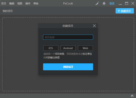
PxCook 用法
-
PxCook(像素大厨)是一款切图设计工具软件。支持 PSD 文件的文字、颜色、距离自动智能识别。
-
Scoop 安装 PxCook:
scoop install pxcook -
使用方法:创建项目 → 输入 项目名称、项目类型 Web → 单击按钮【创建项目】 → 单击按钮【添加】,导入设计稿
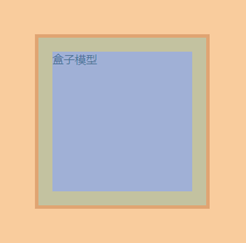
盒子模型
- 在网页设计中,每个 HTML 元素都可以看作是一个矩形的盒子,这个概念就是 CSS 盒子模型。
- CSS 盒子模型描述了一个元素在页面上所占据的空间,以及元素的内容、内边距、边框和外边距之间的关系。
- CSS 盒子模型的标准模式和怪异模式(Quirks Mode)有所不同,具体涉及到盒子模型中的尺寸计算方式,开发时需要注意。
- 可以使用
box-sizing属性来调整元素的盒子模型,包括content-box(默认,只计算内容的宽度)、border-box(包括内边距和边框在内的尺寸计算)等。
| 盒子模型部分 | CSS 属性名 | 描述 |
|---|---|---|
| 内容区 | width |
内容区即元素的实际内容,它的宽度由该属性决定。 |
height |
内容区即元素的实际内容,它的高度由该属性决定。 | |
| 内边距 | padding |
内边距指的是元素内容与边框之间的空间,用于控制元素内容与边框之间的距离。 该属性可以设置上、右、下、左四个方向的内边距值,也可以分别设置每个方向的内边距值。 |
| 边框 | border |
边框是围绕元素内容和内边距的线条,用于包围元素。 该属性可以设置边框的样式、宽度和颜色。不同方向的边框样式可以分别设置,也可以设置统一的边框样式。 |
| 外边距 | margin |
外边距指的是元素与相邻元素之间的空间,用于控制元素与其他元素之间的距离。 该属性可以设置上、右、下、左四个方向的外边距值,也可以分别设置每个方向的外边距值。 |
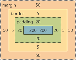
| 总宽度和高度 (标准盒子模型) | 元素的总宽度和高度由内容区、内边距、边框和外边距的尺寸之和决定,不具体对应单一的 CSS 属性,而是通过各部分属性的设置共同决定。 具体计算公式为: 宽度 = 左外边距 + 左边框 + 左内边距 + 内容区宽度 + 右内边距 + 右边框 + 右外边距 同样的规则适用于高度的计算。 |
组成
CSS 盒子模型由以下四个主要部分组成:
- Content(内容区域):这是元素的实际内容,如文字、图像等。内容区域的尺寸由元素的宽度
width和高度height属性决定。 - Padding(内边距):内边距是内容区域与元素边框之间的空白区域。它可以用来控制内容与边框之间的距离。内边距的大小由
padding属性决定。 - Border(边框):边框是围绕在内容和内边距外部的线条。边框可以有不同的样式、宽度和颜色。边框的样式由
border属性决定。 - Margin(外边距):外边距是元素边框与相邻元素之间的空白区域。它可以用来控制元素之间的间隔。外边距的大小由
margin属性决定。
div {
  margin: 50px;
  border: 5px solid brown;
  padding: 20px;
  width: 200px;
  height: 200px;
  background-color: pink;
}
边框 border
| 属性 | 描述 | 取值 |
|---|---|---|
border |
设置元素的边框 | 宽度 样式 颜色 |
border-width |
设置元素边框的宽度 | 数值或 thin、medium、thick |
border-style |
设置元素边框的样式 | none、hidden、dotted、dashed、solid、double、groove、ridge、inset、outset |
border-color |
设置元素边框的颜色 | 颜色值、transparent |
border-top |
设置元素顶部边框 | 宽度 样式 颜色 |
border-right |
设置元素右侧边框 | 宽度 样式 颜色 |
border-bottom |
设置元素底部边框 | 宽度 样式 颜色 |
border-left |
设置元素左侧边框 | 宽度 样式 颜色 |
- 边框 Border 是围绕元素内容和内边距的线条,用于给元素添加装饰、分隔和边界效果。
- 边框可以设置为不同的样式、宽度和颜色,从而实现多样化的外观效果。
- 边框样式属性用于设置元素的边框外观。以下是常用的边框样式属性:
- border-width:设置边框的宽度,可以是像素、百分比等。
- border-style:设置边框的样式,如实线、虚线、点线等。
- border-color:设置边框的颜色。
- border:可以同时设置上述三个属性的缩写形式,如
border: 2px solid black;。
<!DOCTYPE html>
<html>
  <head>
    <style>
      .box {
        width: 200px;
        height: 100px;
        border: 2px solid black; /* 边框样式 */
        padding: 20px;
      }
    </style>
  </head>
  <body>
    <div class="box">This is a box with a border.</div>
  </body>
</html>
- 创建一个名为
.box的<div>元素,并设置了其宽度、高度、内边距和边框。 - 通过
border属性,将元素的边框样式设置为实线(solid),宽度为 2 像素,颜色为黑色。
内边距 padding
| 属性 | 描述 |
|---|---|
padding |
设置元素的内边距 |
padding-top |
设置元素顶部内边距 |
padding-right |
设置元素右侧内边距 |
padding-bottom |
设置元素底部内边距 |
padding-left |
设置元素左侧内边距 |
- 内边距 Padding 是指元素内容与元素边框之间的空白区域。通过设置内边距,可以控制元素内容与边框之间的距离。
- 内边距属性用于设置元素的内边距,即内容与边框之间的距离。以下是常用的内边距属性:
- padding-top:设置上内边距。
- padding-right:设置右内边距。
- padding-bottom:设置下内边距。
- padding-left:设置左内边距。
- padding:可以同时设置上述四个属性的缩写形式,如
padding: 20px;。
padding的取值可以是长度值(如px、em、rem)、百分比(相对于包含块的宽度)、auto(由浏览器决定内边距的大小)或inherit(继承父元素的内边距值)。- 内边距通常用于为元素的内容提供一定的间隔,使内容不会紧贴在边框边缘。
padding 多值写法
| 值 | 描述 | 示例 |
|---|---|---|
| 单个值 | 所有 4 个方向的内边距均相等 | padding: 10px; |
| 两个值 | 上下内边距相等,左右内边距相等 | padding: 10px 20px; |
| 三个值 | 上内边距,左右内边距相等,下内边距 | padding: 10px 20px 30px; |
| 四个值 | 上、右、下、左内边距各自独立设置 | padding: 10px 20px 30px 40px; |
<!DOCTYPE html>
<html>
  <head>
    <style>
      .box {
        width: 200px;
        height: 100px;
        border: 2px solid black;
        padding: 10px 20px 30px 40px; /* 内边距样式:上 右 下 左 */
      }
    </style>
  </head>
  <body>
    <div class="box">This is a box with different paddings.</div>
  </body>
</html>
外边距 margin
- 外边距 Margin 是指元素边框与相邻元素之间的空白区域。
- 通过设置外边距,可以控制元素与其周围元素之间的间隔。
- 边距属性用于设置元素与相邻元素之间的间隔。以下是常用的外边距属性:
- margin-top:设置上外边距。
- margin-right:设置右外边距。
- margin-bottom:设置下外边距。
- margin-left:设置左外边距。
- margin:可以同时设置上述四个属性的缩写形式,如
margin: 20px;。
- 外边距可以用于在布局中为元素添加间隔,实现元素之间的分隔、居中等效果。
- 外边距可以通过负值来将元素推进相邻元素的区域内部,实现重叠和特殊效果。
margin 多值写法
| 值 | 描述 | 示例 |
|---|---|---|
| 单个值 | 所有 4 个方向的外边距均相等 | margin: 10px; |
| 两个值 | 上下外边距相等,左右外边距相等 | margin: 10px 20px; |
| 三个值 | 上外边距,左右外边距相等,下外边距 | margin: 10px 20px 30px; |
| 四个值 | 上、右、下、左外边距各自独立设置 | margin: 10px 20px 30px 40px; |
尺寸计算
-
默认情况:盒子尺寸 = 内容尺寸 + border 尺寸 + 内边距尺寸
-
结论:给盒子加 border / padding 会撑大盒子
-
解决:
- 手动做减法,减掉 border / padding 的尺寸
- 內减模式:box-sizing: border-box
版心居中
- 使用空白间距:通过设置左右的边距使内容居中。可以通过 CSS 中的
margin属性来实现,设置左右边距为auto,将内容自动居中。要求盒子必须要有宽度。
.box {
  margin: 0 auto;
  width: 1000px;
  height: 200px;
  background-color: pink;
}
清除默认样式
默认样式
- HTML 元素的默认样式是由浏览器提供的,它们在浏览器中被称为 " 用户代理样式表 "(user agent stylesheet)。
- User agent stylesheets
- 不同的浏览器提供的默认样式可能有所不同,但是通常包括以下内容:
- 字体样式:默认字体大小、颜色、字体家族等。
- 边框样式:默认边框宽度、样式、颜色等。
- 行高和行距:默认行高和行距。
- 文本样式:默认文本对齐方式、缩进、间距等。
默认样式的意义
- 因为 HTML 是一个比较简单的文档型的,这样一种标记语言,所以它必然要带一些默认样式才让我们直接写完标记有表现。
- HTML 默认样式的意义在于为网页提供一个基础的样式框架,使得页面中所有 HTML 元素在不同的浏览器和操作系统上都能够以一致的方式呈现。这样,用户可以更加便捷地访问和使用网页,给用户更加统一的使用体验。同时也可以帮助开发人员减少开发时间和成本。
- HTML 默认样式的另一个作用是提供了一种默认的样式表,使得开发人员可以基于默认样式进行调整和定制,而不必从头开始编写样式。这可以节省开发时间和精力,同时也可以提高开发效率和一致性。
默认样式带来的问题
- 由于不同的浏览器提供的默认样式可能存在差异,而且默认样式不一定符合每个开发人员的需求。
- 因此,在实际开发中,为了确保页面的外观和行为一致,开发者需要编写 CSS 样式重置默认样式,以确保所有元素都以一致的方式显示,以满足具体的设计要求和需求。
CSS Reset
- 浏览器提供的默认样式也会带来一些问题:
- 有一些样式是我们预期之外的。
- 各个浏览器的默认样式并不完全一样。
- 那处理这个问题的解决方案呢?就是 CSS reset。
<!DOCTYPE html>
<html>
  <head>
    <meta charset="UTF-8" />
    <meta name="viewport" content="width=device-width, initial-scale=1.0" />
    <meta http-equiv="X-UA-Compatible" content="ie=edge" />
    <title>default style</title>
  </head>

  <body>
    <div>DIV 元素</div>
    <ul>
      <li>LI 元素</li>
      <li>LI 元素</li>
    </ul>
  </body>
</html>
使用通用选择器
- 这种方式因为使用通用选择器,所以会带来性能的问题。
<!DOCTYPE html>
<html>
  <head>
    <meta charset="UTF-8" />
    <meta name="viewport" content="width=device-width, initial-scale=1.0" />
    <meta http-equiv="X-UA-Compatible" content="ie=edge" />
    <title>default style</title>
    <style>
      * {
        margin: 0;
        padding: 0;
      }
    </style>
  </head>

  <body>
    <div>DIV 元素</div>
    <ul>
      <li>LI 元素</li>
      <li>LI 元素</li>
    </ul>
  </body>
</html>
样式归零
-
把默认样式都干掉归零。
/* http://meyerweb.com/eric/tools/css/reset/
   v2.0 | 20110126
   License: none (public domain)
*/

html, body, div, span, applet, object, iframe,
h1, h2, h3, h4, h5, h6, p, blockquote, pre,
a, abbr, acronym, address, big, cite, code,
del, dfn, em, img, ins, kbd, q, s, samp,
small, strike, strong, sub, sup, tt, var,
b, u, i, center,
dl, dt, dd, ol, ul, li,
fieldset, form, label, legend,
table, caption, tbody, tfoot, thead, tr, th, td,
article, aside, canvas, details, embed,
figure, figcaption, footer, header, hgroup,
menu, nav, output, ruby, section, summary,
time, mark, audio, video {
	margin: 0;
	padding: 0;
	border: 0;
	font-size: 100%;
	font: inherit;
	vertical-align: baseline;
}
/* HTML5 display-role reset for older browsers */
article, aside, details, figcaption, figure,
footer, header, hgroup, menu, nav, section {
	display: block;
}
body {
	line-height: 1;
}
ol, ul {
	list-style: none;
}
blockquote, q {
	quotes: none;
}
blockquote:before, blockquote:after,
q:before, q:after {
	content: '';
	content: none;
}
table {
	border-collapse: collapse;
	border-spacing: 0;
}
-
CSS Reset - YUI Library (clarle.github.io)
<!-- Include Dependencies -->
<link rel="stylesheet" type="text/css" href="http://yui.yahooapis.com/3.18.1/build/cssreset/cssreset-min.css" />

<!-- Using CSS Reset Contextually -->
<div>
  <div id="left-column" class="yui3-cssreset"><h1>Lorem Ipsum</h1></div>
  <div id="right-column"><h1>Lorem Ipsum</h1></div>
</div>
样式调整
Normalize.css makes browsers render all elements more consistently and in line with modern standards. It precisely targets only the styles that need normalizing.
-
Normalize.css 使用了一种不同的思路。它的基本策略是这样的,既然浏览器给了我们默认样式,那它就是有意义的,那我为什么要把这个默认样式干掉呢?我应该处理的是,如果这个默认样式不一致,我把它变得一致就好了,所以这就是 normalize 的出发点。
-
normalize 会保留一些元素的 margin 和 padding。同时它会去做一些修正,比如说输入框在各个浏览器下面的宽度,高度的定义是不统一的。那么它会尝试去做一些修正,让你的定义变得更统一。
<link rel="stylesheet" type="text/css" href="https://yarnpkg.com/en/package/normalize.css" />
内容溢出 overflow
- 当元素的内容超出其容器的尺寸时,会发生内容溢出。
- CSS 中的
overflow属性用于控制元素在发生内容溢出时的表现方式,如是否显示滚动条、裁剪内容或隐藏溢出部分。
| 属性值 | 描述 |
|---|---|
visible(默认值) |
内容溢出时,会超出元素的边界,不会被修剪,会覆盖到其他元素上方。 |
hidden |
内容溢出时,会被修剪,超出元素的部分将被隐藏,不会显示在页面上。 |
scroll |
内容溢出时,会显示滚动条,用户可以通过滚动条来查看超出元素的部分。 |
auto |
内容溢出时,会根据情况显示滚动条。如果内容未溢出,则不显示滚动条;如果内容溢出,则显示滚动条。 |
| 功能 | CSS 样式 |
|---|---|
| 防止内容溢出破坏布局 | overflow: hidden; |
| 创建可滚动的容器 | overflow: scroll; 或 overflow: auto; |
| 隐藏多行文本的溢出 | white-space: nowrap; 和 text-overflow: ellipsis; |
<!DOCTYPE html>
<html>
  <head>
    <style>
      .container {
        width: 200px;
        height: 100px;
        border: 2px solid black;
        overflow: auto; /* 自动显示滚动条 */
      }

      .content {
        padding: 10px;
      }
    </style>
  </head>
  <body>
    <div class="container">
      <div class="content">
        This is some overflowing content. This is some overflowing content. This is some overflowing content.
      </div>
    </div>
  </body>
</html>
外边距合并与塌陷 Margin Collapsing
-
区块的上下外边距有时会合并(折叠)为单个边距,其大小为两个边距中的最大值(或如果它们相等,则仅为其中一个),这种行为称为外边距折叠。注意:有设定浮动和绝对定位的元素不会发生外边距折叠。
-
有三种情况会形成外边距折叠:
- 相邻的兄弟元素:相邻的同级元素之间的外边距会被折叠(除非后面的元素需要清除之前的浮动)。
- 没有内容将父元素和后代元素分开:如果没有设定边框(
border)、内边距(padding)、行级(inline)内容,也没有创建区块格式化上下文或间隙来分隔块级元素的上边距(margin-top)与其内一个或多个子代块级元素的上边距(margin-top);或者没有设定边框、内边距、行级内容、高度(height)或最小高度(min-height)来分隔块级元素的下边距(margin-bottom)与其内部的一个或多个后代后代块元素的下边距(margin-bottom),则会出现这些外边距的折叠,重叠部分最终会溢出到父代元素的外面。 - 空的区块:如果块级元素没有设定边框、内边距、行级内容、高度(
height)、最小高度(min-height)来分隔块级元素的上边距(margin-top)及其下边距(margin-bottom),则会出现其上下外边距的折叠。
-
一些需要注意的地方:
- 上述情况的组合会产生更复杂的(超过两个外边距的)外边距折叠。
- 即使某一外边距为 0,这些规则仍然适用。因此就算父元素的外边距是 0,第一个或最后一个子元素的外边距仍然会(根据上述规则)" 溢出 " 到父元素的外面。
- 如果包含负边距,折叠后的外边距的值为最大的正边距与最小(绝对值最大)的负边距的和。
- 如果所有的外边距都为负值,折叠后的外边距的值为最小(绝对值最大)的负边距的值。这一规则适用于相邻元素和嵌套元素。
- 外边距折叠仅与垂直方向有关。
display设置为flex或grid的容器中不会发生外边距折叠。
外边距合并
我们给 child1 设置了 margin-bottom:20px,给 child2 设置了 margin-top: 50px,但最终的展现效果确实 50px
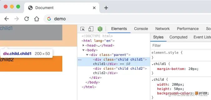
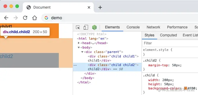
- CSS 外边距合并(Margin Collapsing)指的是当两个或多个相邻的元素的外边距相遇时,它们会合并形成一个单一的外边距。
- 外边距合并只会发生在垂直方向上(上下方向),而不会在水平方向上(左右方向)发生。
- 兄弟元素(上下相邻元素)的外边距合并:当两个上下相邻的块级元素,没有其他内容(如边框、内边距或内容)来分隔它们时,它们的上下外边距会合并成一个外边距,取其中较大的值作为合并后的外边距。这种合并称为 " 相邻块级元素合并 "。
<!DOCTYPE html>
<html>
  <head>
    <style>
        .box1 {
        width: 100px;
        height: 100px;
        margin-bottom: 20px;
          background-color: pink;
      }

      .box2 {
        width: 100px;
        height: 100px;
        margin-top: 30px;
          background-color: orange;
      }
    </style>
  </head>
  <body>
    <div class="box1">Box 1</div>
    <div class="box2">Box 2</div>
  </body>
</html>
外边距塌陷
我们给 child 添加了 margin-top,却导致 body 整体下移。
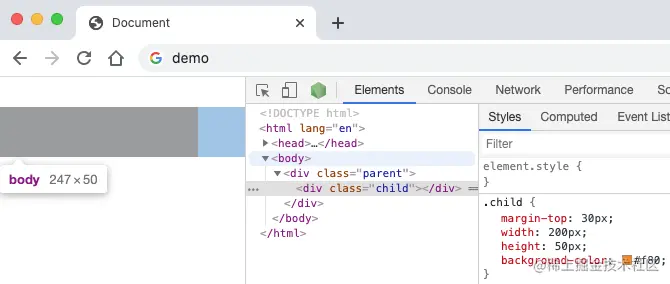
- 场景:父子级的标签,子级的添加 上外边距 会产生塌陷问题
- 现象:导致父级一起向下移动
- 解决方法:
- 使用 padding:取消子级
margin,父级设置padding,可以避免父子元素外边距塌陷。 - 触发 BFC:通过为父元素设置
overflow: hidden;、display: inline-block;或其他能触发 BFC(块格式化上下文)的方式。 - 使用 border:父级设置
border-top。
- 使用 padding:取消子级
行内元素 – 内外边距问题
- 场景:行内元素添加
margin和padding,无法改变元素垂直位置。 - 解决方法:给行内元素添加 line-height 可以改变垂直位置。
span {
  /* margin 和 padding 属性,无法改变垂直位置 */
  margin: 50px;
  padding: 20px;
  /* 行高可以改变垂直位置 */
  line-height: 100px;
}
圆角 border-radius
- CSS 属性
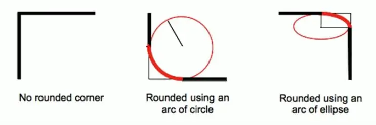
border-radius允许你设置元素的外边框圆角。当使用一个半径时确定一个圆形,当使用两个半径时确定一个椭圆。这个(椭)圆与边框的交集形成圆角效果。 - border-radius 用于设置盒子的圆角;
- border-radius 常见的值:
<length>数值:通常用来设置小的圆角。- 定义圆形半径或椭圆的半长轴,半短轴。负值无效。比如 6px。
- 带
/的两个值:前值设置水平半径,后值设置垂直半径。 - 一个值:该值将相等地设置两个半径。每个半径的四个值按左上、右上、右下、左下的顺序给出。
<percentage>百分比:通常用来设置一定的弧度或者圆形; 使用百分数定义圆形半径或椭圆的半长轴,半短轴。水平半轴相对于盒模型的宽度;垂直半轴相对于盒模型的高度。负值无效。
- border-radius 事实上是一个缩写属性,为了将这四个属性
border-top-left-radius、border-top-right-radius、border-bottom-right-radius,和border-bottom-left-radius简写为一个属性。顺序不能颠倒。 - 想要设置为一个圆:
- 元素是正方形,设置 border-radius 为高度或者宽度的一半即可,或者直接写为 50% (
border-radius: 50%;) 。 - 元素是矩形,设置 border-radius 为高度的一半。
- 元素是正方形,设置 border-radius 为高度或者宽度的一半即可,或者直接写为 50% (
- 即使元素没有边框,圆角也可以用到
background上面,具体效果受background-clip影响。 - 当
border-collapse的值为collapse时,border-radius属性不会被应用到表格元素上。
<!DOCTYPE html>
<html lang="en">
  <head>
    <meta charset="UTF-8" />
    <meta name="viewport" content="width=device-width, initial-scale=1.0" />
    <title>border-radius 实现圆角效果</title>
    <style>
      * {
        margin: 0;
        padding: 0;
        font-family: "Montserrat", sans-serif;
      }

      html,
      body {
        width: 100%;
        height: 100%;
        padding: 30px;
        background-color: #000;
      }

      p {
        font-size: 20px;
        color: #fff;
      }

      hr {
        margin-bottom: 40px;
      }

      .sample {
        display: flex;
        align-items: center;
        margin-bottom: 20px;
      }

      .box-square {
        width: 100px;
        height: 100px;
        margin-right: 60px;
      }

      .box-rectangle {
        width: 100px;
        height: 50px;
        margin-right: 60px;
      }

      .box1 {
        border-radius: 10px;
        background: linear-gradient(to left, #fc466b, #3f5efb);
      }

      .box2 {
        border-radius: 60px 25px;
        background: linear-gradient(to left, #fc466b, #3f5efb);
      }

      .box3 {
        border-radius: 60px 25px 10px;
        background: linear-gradient(to left, #fc466b, #3f5efb);
      }

      .box4 {
        border-radius: 60px 25px 10px 5px;
        background: linear-gradient(to left, #fc466b, #3f5efb);
      }

      .box5 {
        border-radius: 50px;
        background: linear-gradient(to left, #36d1dc, #5b86e5);
      }

      .box6 {
        border-radius: 25px;
        background: linear-gradient(to left, #36d1dc, #5b86e5);
      }

      .box7 {
        border-radius: 50px/10px;
        background: linear-gradient(to left, #c02425, #f0cb35);
      }

      .box8 {
        border-radius: 50px 15px / 10px 25px;
        background: linear-gradient(to left, #c02425, #f0cb35);
      }

      .box9 {
        border-radius: 50px 50px 30px / 10px 25px 50px;
        background: linear-gradient(to left, #c02425, #f0cb35);
      }

      .box10 {
        border-radius: 50px 50px 30px 5px / 10px 25px 50px 30px;
        background: linear-gradient(to left, #c02425, #f0cb35);
      }

      .box11 {
        border-radius: 50px 50px 30px 5px / 50px;
        background: linear-gradient(to left, #c02425, #f0cb35);
      }

      .box12 {
        border-radius: 50px 10px / 30px;
        background: linear-gradient(to left, #c02425, #f0cb35);
      }
    </style>
  </head>

  <body>
    <div class="sample">
      <div class="box-square box1"></div>
      <p>border-radius: 10px;</p>
    </div>
    <div class="sample">
      <div class="box-square box2"></div>
      <p>border-radius:60px 25px;</p>
    </div>
    <div class="sample">
      <div class="box-square box3"></div>
      <p>border-radius:60px 25px 10px;</p>
    </div>
    <div class="sample">
      <div class="box-square box4"></div>
      <p>border-radius:60px 25px 10px 5px;</p>
    </div>
    <hr />
    <div class="sample">
      <div class="box-square box5"></div>
      <p>border-radius: 50px;</p>
    </div>
    <div class="sample">
      <div class="box-rectangle box6"></div>
      <p>border-radius: 25px;</p>
    </div>
    <hr />
    <div class="sample">
      <div class="box-square box7"></div>
      <p>border-radius: 50px/10px;</p>
    </div>
    <div class="sample">
      <div class="box-square box8"></div>
      <p>border-radius: 50px 15px / 10px 25px;;</p>
    </div>
    <div class="sample">
      <div class="box-square box9"></div>
      <p>border-radius: 50px 50px 30px / 10px 25px 50px ;</p>
    </div>
    <div class="sample">
      <div class="box-square box10"></div>
      <p>border-radius: 50px 50px 30px 5px / 10px 25px 50px 30px;</p>
    </div>
    <div class="sample">
      <div class="box-square box11"></div>
      <p>border-radius: 50px 50px 30px 5px / 50px;</p>
    </div>
    <div class="sample">
      <div class="box-square box12"></div>
      <p>border-radius: 50px 10px / 30px;</p>
    </div>
  </body>
</html>
复合写法 - 不带 / 的值
| 值的个数 | 简写 | 等价于 |
|---|---|---|
| 1 | border-radius: 10px; |
border-top-left-radius: 10px;border-top-right-radius: 10px;border-bottom-right-radius: 10px;border-bottom-left-radius: 10px; |
| 2 | border-radius: 10px 20px; |
border-top-left-radius: 10px;border-top-right-radius: 20px;border-bottom-right-radius: 10px;border-bottom-left-radius: 20px; |
| 3 | border-radius: 10px 20px 30px; |
border-top-left-radius: 10px;border-top-right-radius: 20px;border-bottom-right-radius: 30px;border-bottom-left-radius: 20px; |
| 4 | border-radius: 10px 20px 30px 40px; |
border-top-left-radius: 10px;border-top-right-radius: 20px;border-bottom-right-radius: 30px;border-bottom-left-radius: 40px; |
复合写法 - 带 / 的值
| 值的个数 | 简写 | 等价于 |
|---|---|---|
| 1 | border-radius: 10px/20px; |
border-top-left-radius: 10px 20px;border-top-right-radius: 10px 20px;border-bottom-right-radius: 10px 20px;border-bottom-left-radius: 10px 20px; |
| 2 | border-radius: 10px 20px/30px 40px; |
border-top-left-radius: 10px 30px;border-top-right-radius: 20px 40px;border-bottom-right-radius: 10px 30px;border-bottom-left-radius: 20px 40px; |
| 3 | border-radius: 10px 20px 30px/20px 30px 40px; |
border-top-left-radius: 10px 20px;border-top-right-radius: 20px 30px;border-bottom-right-radius: 30px 40px;border-bottom-left-radius: 20px 30px; |
| 4 | border-radius: 10px 20px 30px 40px/20px 30px 40px 50px; |
border-top-left-radius: 10px 20px;border-top-right-radius: 20px 30px;border-bottom-right-radius: 30px 40px;border-bottom-left-radius: 40px 50px; |
盒子阴影 box-shadow
-
CSS
box-shadow属性用于在元素的框架上添加阴影效果。你可以在同一个元素上设置多个阴影效果,并用逗号将他们分隔开。该属性可设置的值包括阴影的 X 轴偏移量、Y 轴偏移量、模糊半径、扩散半径和颜色。 -
box-shadow 属性可以设置一个或者多个阴影
- 每个阴影用
<shadow>表示 - 多个阴影之间用逗号
,隔开,从前到后叠加
- 每个阴影用
-
<shadow>的常见格式:<shadow> = <color>? && [<length>{2} <length [0,∞]>? <length>?] && inset?- 第 1 个
<length>:horizontal offset, offset-x, 水平方向的偏移,正数往右偏移 - 第 2 个
<length>:vertical offset, offset-y, 垂直方向的偏移,正数往下偏移 - 第 3 个
<length [0,∞]>:blur-radius, 模糊半径 - 第 4 个
<length>:vertical offset, 延伸/扩散半径 <color>:阴影的颜色,如果没有设置,就跟随 color 属性的颜色inset:外框阴影变成内框阴影
- 第 1 个
-
我们可以通过一个网站测试盒子的阴影:Box Shadow CSS Generator | 𝗧𝗛𝗘 𝗕𝗘𝗦𝗧 𝗢𝗡𝗟𝗜𝗡𝗘 𝗖𝗦𝗦 𝗚𝗘𝗡𝗘𝗥𝗔𝗧𝗢𝗥
-
几乎可以在任何元素上使用
box-shadow来添加阴影效果。如果元素同时设置了border-radius属性,那么阴影也会有圆角效果。多个阴影在 z 轴上的顺序和多个 text shadows 规则相同 (第一个阴影在最上面)。 -
Box-shadow generator 是一个允许你生成
box-shadow的交互式工具。
/* x 偏移量 | y 偏移量 | 阴影颜色 */
box-shadow: 60px -16px teal;

/* x 偏移量 | y 偏移量 | 阴影模糊半径 | 阴影颜色 */
box-shadow: 10px 5px 5px black;

/* x 偏移量 | y 偏移量 | 阴影模糊半径 | 阴影扩散半径 | 阴影颜色 */
box-shadow: 2px 2px 2px 1px rgba(0, 0, 0, 0.2);

/* 插页 (阴影向内) | x 偏移量 | y 偏移量 | 阴影颜色 */
box-shadow: inset 5em 1em gold;

/* 任意数量的阴影,以逗号分隔 */
box-shadow: 3px 3px red, -1em 0 0.4em olive;

/* 全局关键字 */
box-shadow: inherit;
box-shadow: initial;
box-shadow: unset;
取值
-
inset: 如果没有指定inset,默认阴影在边框外,即阴影向外扩散。使用inset关键字会使得阴影落在盒子内部,这样看起来就像是内容被压低了。此时阴影会在边框之内 (即使是透明边框)、背景之上、内容之下。 -
<offset-x><offset-y>: 这是头两个<length>值,用来设置阴影偏移量。x,y 是按照数学二维坐标系来计算的,只不过 y 垂直方向向下。<offset-x>设置水平偏移量,正值阴影则位于元素右边,负值阴影则位于元素左边。<offset-y>设置垂直偏移量,正值阴影则位于元素下方,负值阴影则位于元素上方。可用单位请查看<length>。如果两者都是 0,那么阴影位于元素后面。这时如果设置了<blur-radius>或<spread-radius>则有模糊效果。需要考虑inset -
<blur-radius>: 这是第三个<length>值。值越大,模糊面积越大,阴影就越大越淡。不能为负值。默认为 0,此时阴影边缘锐利。本规范不包括如何计算模糊半径的精确算法,但是,它详细说明如下:对于长而直的阴影边缘,它会创建一个过渡颜色用于模糊 以阴影边缘为中心、模糊半径为半径的局域,过渡颜色的范围在完整的阴影颜色到它最外面的终点的透明之间。 (译者注:对此有兴趣的可以了解下数字图像处理的模糊算法。)
-
<spread-radius>: 这是第四个<length>值。取正值时,阴影扩大;取负值时,阴影收缩。默认为 0,此时阴影与元素同样大。需要考虑inset -
<color>: 相关事项查看<color>。如果没有指定,则由浏览器决定——通常是color的值,不过目前 Safari 取透明。
列表中的每个阴影通过 color 组件(作为颜色),以及 x,y,blur,(合适的时候)加上 spread 组件(作为长度)进行合成。对于每个阴影,如果两个输入的阴影都是 inset 或者都不是 inset,那么要添加的阴影必须考虑已存在的阴影。如果任何一对输入阴影中,一个是 inset,另一个不是 inset,那么整个阴影列表就是不可合成的。如果阴影列表有不同的长度,那么较短的列表会在尾部补上这类阴影:颜色透明,所有长度为 0,inset 还是非 inset 同较长的列表。
语法
box-shadow =
  none       |
  <shadow>#

<shadow> =
  <color>?                                   &&
  [ <length>{2} <length [0,∞]>? <length>? ]  &&
  inset?
综合案例 5
案例 - 产品卡片

<!DOCTYPE html>
<html lang="en">

<head>
  <meta charset="UTF-8">
  <meta name="viewport" content="width=device-width, initial-scale=1.0">
  <title>产品卡片</title>
  <style>
    * {
      margin: 0;
      padding: 0;
      box-sizing: border-box;
    }

    body {
      background-color: #F5F5F5;
    }

    .product {
      margin: 50px auto;
      padding-top: 40px;

      width: 300px;
      height: 250px;
      background-color: #fff;
      border-radius: 10px;
      box-shadow: 0 0 10px rgba(0, 0, 0, .1);
      text-align: center;
    }

    .product__img {
      width: 80px;
      height: 80px;
      margin: 0 auto;
    }

    .product__title {
      margin-top: 20px;
      font-size: 18px;
      font-weight: bold;
      color: #333;
    }

    .product__desc {
      margin-top: 10px;
      font-size: 14px;
      color: #999;
    }
  </style>
</head>

<body>
  <div class="product">
    <div class="product__img">
      <svg width="80" height="80" viewBox="0 0 80 80" fill="none" xmlns="http://www.w3.org/2000/svg">
        <circle cx="40" cy="40" r="40" fill="#FE2C55" />
        <path
          d="M59.0472 51.1156L58.0751 50.7528C57.589 50.5109 56.9409 50.5109 56.4549 50.7528L52.2423 52.325L39.9287 56.9206L23.5645 50.7528C23.0784 50.5109 22.4303 50.5109 21.9443 50.7528L20.9721 51.1156C19.676 51.5994 19.676 52.9297 20.9721 53.4134L39.1186 60.1859C39.6046 60.4278 40.2527 60.4278 40.7388 60.1859L58.8852 53.4134C60.3434 52.9297 60.3434 51.5994 59.0472 51.1156Z"
          fill="white" />
        <path
          d="M20.9756 28.3887L39.187 34.5294C39.6748 34.7487 40.3252 34.7487 40.813 34.5294L59.0244 28.3887C60.3252 27.95 60.3252 26.7438 59.0244 26.3052L40.813 20.1645C40.3252 19.9452 39.6748 19.9452 39.187 20.1645L20.9756 26.3052C19.6748 26.7438 19.6748 27.95 20.9756 28.3887Z"
          fill="white" />
        <path
          d="M36.3265 50.2424V40.7464C36.3265 39.788 37.0099 38.9648 37.9684 38.9594C40.3521 38.9461 44.4898 39.6983 44.4898 45.0817C44.4898 51.1627 39.2101 51.3345 37.1427 51.1686C36.665 51.1303 36.3265 50.7216 36.3265 50.2424Z"
          stroke="white" stroke-width="3" stroke-linecap="round" />
        <path
          d="M31 37L26.748 35.1398C24.9803 34.3664 23 35.6615 23 37.591V37.591C23 38.7507 23.6865 39.8003 24.7489 40.2651L29.4 42.3C30.372 42.7252 31 43.6855 31 44.7464V46.442C31 47.8843 29.5197 48.8524 28.1984 48.2743L23 46"
          stroke="white" stroke-width="3" stroke-linecap="round" />
        <path fill-rule="evenodd" clip-rule="evenodd"
          d="M58.2076 34.3898C58.699 33.7228 58.5567 32.7838 57.8898 32.2924C57.2229 31.801 56.2838 31.9432 55.7924 32.6102L51.5 38.4356V36C51.5 35.1715 50.8284 34.5 50 34.5C49.1716 34.5 48.5 35.1715 48.5 36V43V49C48.5 49.8284 49.1716 50.5 50 50.5C50.8284 50.5 51.5 49.8284 51.5 49V43.4929L52.3464 42.3442L55.7612 47.3459C56.2283 48.03 57.1616 48.206 57.8458 47.7389C58.53 47.2718 58.7059 46.3385 58.2388 45.6543L54.4837 40.1542C54.4004 40.0322 54.3024 39.9264 54.1935 39.8375L58.2076 34.3898Z"
          fill="white" />
      </svg>
    </div>
    <div class="product__info">
      <div class="product__title">抖音直播 SDK</div>
      <div class="product__desc">包含抖音直播看播功能</div>
    </div>
  </div>
</body>

</html>
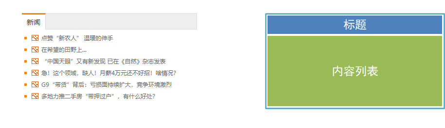
案例 - 新浪新闻
<!DOCTYPE html>
<html lang="en">
  <head>
    <meta charset="UTF-8" />
    <meta name="viewport" content="width=device-width, initial-scale=1.0" />
    <title>新浪新闻</title>
    <style>
      /* reset */
      * {
        margin: 0;
        padding: 0;
        box-sizing: border-box;
      }

      a {
        text-decoration: none;
        color: #333;
      }

      li {
        list-style: none;
      }

      /* news */
      .news {
        width: 500px;
        margin: 50px auto;
      }

      .news__head {
        height: 36px;
        line-height: 36px;
        background-color: #eee;
        border: 1px solid #f1f1f1;
      }

      .news__head a {
        display: inline-block;
        margin-top: -1px;
        padding: 0 10px;
        border-top: 3px solid orange;
        font-size: 14px;
        background-color: #fff;
        color: #333;
      }

      .news__head a:hover {
        background-color: #f5f5f5;
      }

      .news__list {
        padding: 10px;
      }

      .news__list ul li {
        padding-left: 20px;
        background: url("https://s2.loli.net/2023/08/26/NY83GleBXJwZnRs.png") 0 center no-repeat;

        height: 36px;
        line-height: 36px;
        border-bottom: 1px solid #f1f1f1;
      }

      .news__list ul li a {
        padding-left: 20px;
        background: url("https://s2.loli.net/2023/08/26/CAuxEhp52qi7e6g.gif") 0 center no-repeat;
      }

      .news__list ul li a:hover {
        color: #ff8400;
      }
    </style>
  </head>

  <body>
    <div class="news">
      <div class="news__head">
        <a href="#">新闻</a>
      </div>
      <div class="news__list">
        <ul>
          <li><a href="#">点赞“新农人”温暖的伸手</a></li>
          <li><a href="#">在希望的田野上...</a></li>
          <li><a href="#">“中国天眼”又有新发现 已在《自然》杂志发表</a></li>
          <li><a href="#">急!这个领域,缺人!月薪 4 万元还不好招!啥情况?</a></li>
          <li><a href="#">G9“带货”背后:亏损面持续扩大,竞争环境激烈</a></li>
          <li><a href="#">多地力推二手房“带押过户”,有什么好处?</a></li>
        </ul>
      </div>
    </div>
  </body>
</html>